Achieved 25% increase in paid job posting for Bayt
Simplifying the job posting flow to increase form conversion while making it intuitive for our customers.

The Challenge
Job posting is a popular feature of our recruiter product used extensively by HR professionals in the corporate sector, recruitment agencies, and also small and medium scale companies across the middle east.
Through user interviews and surveys, we found that many employers were frustrated with the time it took to post a job. They cited that the process was too complex and time-consuming. This resulted in a 77% abandonment rate.
Our goal for the redesign is to empower the user experience so that they can find relevant candidates faster by reducing the time to post a job.
Here are some of the challenges we identified in the old design.
1. Lengthy Process
The extensive job form did not engage the users. Many users would drop off from it due to the many steps required to post a job. Most of the steps in the wizard weren’t necessary, and there was a need to improve the experience to introduce efficiency in the process.

2. Less applicants due to strict requirements
We noticed that most employers were starting off their job posts with very strict candidate requirements. This led to a very small number of applicants for job posts. Consequently, employers were missing out on a large number of relevant candidates.

3. Applicant Screening
While applying applicant screening criteria, the challenge was in improper information segmentation, leaving users in a digital maze! This was less user-friendly and comprehensive.

4. Broken Purchase and Upgrade Experience
Users with no job posting plan could not directly check out from the form. To post a job, users had to leave the journey to purchase a plan before advancing, leaving users confused and making the process lengthy and time-consuming.

Competitive Analysis
Our competitive analysis revealed that leading job posting platforms in the region and worldwide have adopted simplified job posting processes, resulting in higher user satisfaction and increased job postings. We identified specific features that our competitors are offering, which we can learn from and possibly implement.
Solution
The solutions aim to make the process easier and user-friendly. Hence shortening their path to attract the best talent on the platform. Below are some new solutions added for users for a better experience.
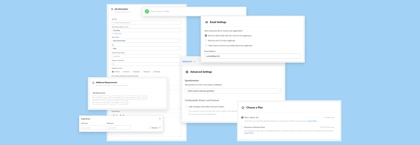
A simple two-step process
Step 1: Job Information and Additional Requirements.
The puzzling experience will be segmented, organised, and simplified into a single-page with two main sections: Personal Information and Additional Requirements.
The personal information section collects the basic information required to post a job including job title, location, job description and desired skills.
The “Additional Requirements” section allows users to add candidate requirements. The user can mark a requirement as mandatory. In contrast to the previous design, additional requirements are not a distinct mandatory step in the job posting process. This restructuring led to lesser irrelevant criteria on job posts.

Step 2: Settings and Checkout
The next step involves users adding their email, and selecting their plan to post a job.
Under the ‘Advanced Settings’ option, users can access features such as confidentiality settings, adding a questionnaire and options to configure job post duration. These advanced options are now conveniently tucked away to avoid overwhelming users during the initial job posting process.
On the same page, users are given the ability to choose a job post plan as per preference, purchase and post a job with just two clicks within the job posting experience.

Timeline and Challenges
The feature took a few months to be rolled out due to challenges in integrating the checkout feature in the flow and developing new components in the design system to be used within the feature.
Improvements
Further improvements in the experience include:
- Lesser required fields to encourage conversion.
- Automatically saving drafts so users could resume or edit their form and follow the flow when required.
- Advanced options were hidden under advanced settings
Demo
Results
The new experience was warmly welcomed by our existing and new clients leading to better experience and conversion.
25% increase in paid job postings
1.7x increase in form conversion rate
Future Iterations
In future iterations, the form was further improved:
- Introducing pre-written job descriptions for popular job titles
- Introducing AI to recommend job details and screening criteria based on user requirements

